








Google's 'G' logo redesign: a technical retrospective
Writer :By: Admin
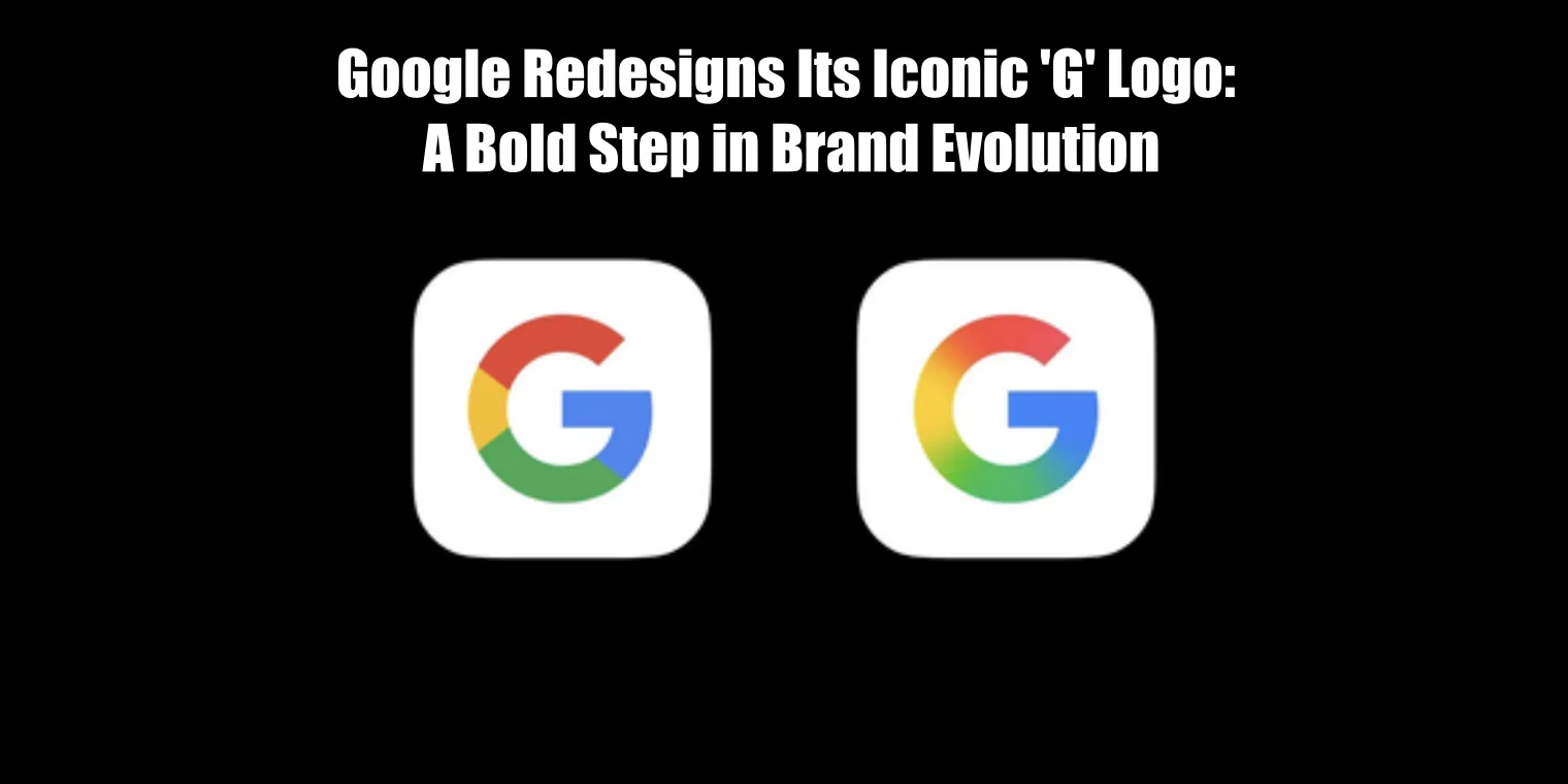
Years after Google updated its four-colour 'G' logo, the project remains a useful case study in the engineering of a brand. The visual changes were the final output of a process that involved significant technical challenges. This retrospective looks past the aesthetics to analyse the implementation: the shift to resolution-independent graphics, the adherence to accessibility standards and the sheer scale of deployment across a global product ecosystem.
## From pixels to vectors The previous logo was often deployed as a raster image, a bitmap that degraded at high resolutions and required multiple sizes for different device densities. The redesigned 'G' was built as a vector graphic (SVG), defined by mathematical equations rather than a grid of pixels. This ensures it renders sharply on any display from a watch face to a 4K monitor. The trade-off is a minor increase in computational cost for rendering, a negligible price for infinite scalability. The geometry was also simplified, using perfect circles and arcs which made the SVG code cleaner and the file size smaller.
## A colour palette for digital screens The redesign adjusted the brand colours. This was not just a subjective aesthetic choice but a technical one. The new hex codes were selected for better performance on digital screens, specifically within the sRGB colour gamut which is the standard for the web. Older brand colours may have been chosen for print and can appear muted or inconsistent on modern displays. The new palette also had to be tested against both light and dark backgrounds to ensure the 'G' remained legible without needing separate, inverted logo files for each theme.
## The engineering of a global rollout Scalability meant more than just resizing the image. It meant replacing the asset across thousands of products, web properties and APIs. This is a complex engineering task. The process requires a robust asset pipeline, version control and a strategy for clearing caches across content delivery networks (CDNs). A failure to update the logo on one obscure but critical login page could erode user trust. This highlights that a brand update at this scale is as much a DevOps challenge as it is a design one.
## Designing for clearer contrast The updated colour palette was also driven by accessibility requirements. Each of the four colours used in the logo had to provide sufficient contrast against its neighbours and against common background colours. These ratios are defined by standards like the Web Content Accessibility Guidelines (WCAG). For example, the red and yellow segments meet at a point, but their contrast against a white background must meet a minimum threshold. The trade-off is that strict adherence to WCAG can limit the available colour palette, forcing a choice between pure brand identity and usability for people with visual impairments. Google chose usability.
## A component in a larger system The 'G' logo is a single component in Google's vast design system. Its redesign was part of a wider effort to standardise visual elements, typography and interaction patterns across all Google products. Building and maintaining such a system is a core discipline of modern software development. It involves creating libraries of reusable UI components that teams can import, ensuring that a button or a search bar looks and functions the same in Gmail as it does in Google Maps. This systematic approach reduces design and development debt and allows teams to build products faster.
## Conclusion Google's 'G' logo redesign serves as a reminder that a brand is a system. A seemingly simple visual update requires a deep investment in engineering infrastructure, from vector graphic formats and accessible colour palettes to the CI/CD pipelines needed to deploy changes globally. For any organisation, updating a visual identity is a technical project that touches every part of the technology stack. The success of such a project depends on treating it as one.